![]()
Here’s some background.
First, the messaging required a tuneup.
ACS helps millions of people through a myriad of programs that include research, patient services, prevention, community engagement, and political advocacy.
With such a broad spectrum, it was necessary to distill the complexity so that everything was more simple, direct, and understandable. AND, uniquely identifiable. AND, emotionally resonant.
Preach, then practice.
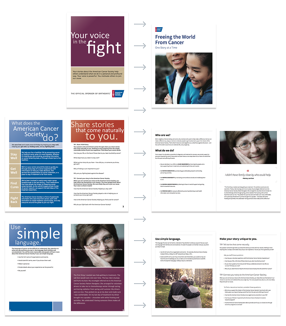
Cancer inherently involves fear, anxiety, and insecurity, so, visually, a sense of stability and trust had to be shown. To reflect the messaging, the design system had to be calibrated for simplicity, accessibility, and tone.
Breaking down the system to just the essentials allowed for regression and progression as needed. The large non-profit, limited in its resources and extremely slow to change, necessitated a gradual transition, as the old and the new had to commingle for a very long time.
Reduce, reuse, and upcycle.
Crucial to everything was providing a spectrum of the human experience. A diversity of emotions, situations, and human qualities had to be represented, because ACS helps and is helped by everyone.
Simplified iconography was created to support content and, like the photography, move beyond stock assets.
With the components determined, the new visual language was used to translate pieces in the field. A critical aspect of updating the pieces was to firmly establish hierarchy, a grid, and the “chunking” of copy, so that content could be easily scanned and digested. Finding information quickly is important, especially for constituents who have to contend with the duress of cancer.

contributions: art direction, brand strategy, copywriting, creative direction, illustration, visual design